for my music magazine i have decided to go with the genre of rock, and so to do this i needed to find a rock band who would let me photograph them in a photo shoot that i set up and take the pictures of or put a fake band together to do a photo shoot.
Luckily, a friend of mine who is in a rock band, and her band have agreed to let me photograph them for my magazine. The band is called ETC -'Embrace the City' and i will have to think of and make up a story that could go along side the pictures in my magazine.
THE GENRE: what and why...
ROCK- I have decided this is my chosen genre, because it is the genre of music I love, and know the most about so I think I would be able to produce a piece of work to the best of my ability.Rock is also a growing genre in popularity it seems, with bands making it more popular such as, 'Paramore', 'You Me At Six', 'Muse' etc...
ANALYSING:
The following magazine covers i am analysing are all from rock based magazines and contain conventions of a rock magazine cover.
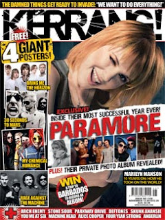
KERRANG!
Kerrang is one of the most popular rock music magazines in Britain.
It follows a lot of the key conventions of a rock music magazine cover:
· Big masthead central at the top
· Freebies (posters) in the magazine advertised on the front
· ‘WIN’- competitions
· Main article picture taking up most of the page
· What else is in the magazine
· Persuading words such as, ‘Exclusive’, ‘private’, ‘revealed’ ‘free’
· 10 pictures on the cover without being over powering or messy
· Includes well known bands
ROCKSOUND
Conventions
· ‘WIN!’ ‘Exclusive’ ’10 page sepcial’
· Freebies- posters, stickers, CD
· One main article picture, taking up whole of page
· About four main colours, so does not look messy
· Posed picture
· Lots of other well known bands mentioned on front page alone
Masthead Font?
In most rock music magazines, and for example the above two covers, the masthead fonts are both Big, and bold, they don't play around with colour too much, most rock associated magazines generally focus the colour schemes around black, white, red, a lot also have scratches, cuts etc on them to represent the aggression, loudness, sometimes noisy connotations that the genre give.
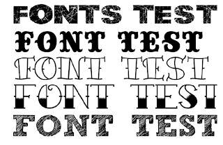
Looking at fonts.
Existing rock magazine fonts:

These are all really bold and following the rock colour scheme are either red, black or white
A few fonts I have found that are vaguely related or fit with he rock genre, which is the best?
MASTHEAD NAMES
Obviously the name of the magazine is very important, it can't be to cheesy, it could be one of the main aspects that sells the magazine. Examples of existing names are:
Kerrang!- whos name comes form the noise an electric guitar makes when being pinged.
RockSound or Rock Sound
NME- New Musical Express
Metal Hammer
Big Cheese
most magazine names have about a maximum amount of words of two or abbreviated into one.
Name Ideas
ROCK SHOP
ROCK SHOW
ROCKABILITY
SIGNED
PURE ROCK
In the end I chose ROCKABILITY, to me it sounded the best out of all the ideas, and I asked a few others who also said it was one of the best ideas.
It also has rock in it so the reader knows the genre of the magazine. The merging of rock and ability also give the impression the contents and bands inside are good at what they do and have 'the ability to rock'
Slogan
A lot of Rock music magazines have a slogan that are about 4/5 words long that have relevance to rock music and associate their magazine with their slogan.Examples of magazine slogans are:
Live life loud- use of alliteration
Alternative music mayhem- most rock magazine slogans often use words like 'chaos', or 'mahyem' etc to fit with the edginess of the rock genre.
New music first
Music with attitude
I'm thinking of adding a slogan to my blog.
Ideas are:
'Rock till you drop'
'Rock me till you drop me'
'Rock is what we do'
Additional articles mentioned on the cover
Examples of existing articles on front cover
Which is better? What is good? What changes could improve it?
First attempt Second attempt (real/ final front cover)
My comments on the covers:
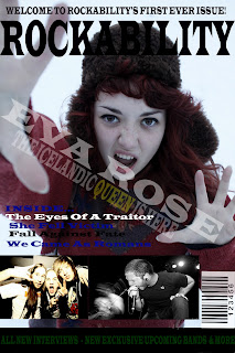
after analysing existing magazine covers I made two covers to compare to each other to see which is best. I prefer the second attempt as it doesn't look as squashed up as the first attempt does, making the second piece look more professional, this attempt also shows my ability to use more techniques on the software I used, for example, the smaller pictures look better faded into the page rather than looking copied and pasted like in the first attempt.
When I gave examples of fonts I could use for my masthead and the the font, I actually went against them, this is because when I was looking at existing masthead fonts they were actually very simple, so I decided to reflect this obvious convention in the second attempt, I actually think this makes the page look more structured.
looking at the feedback of both covers I have decided to definitely use the second attempt cover, and improve by making the changes advised.
Feedback
‘I prefer the second attempt of the magazine cover, the editing is better, the way you managed to put the mast head behind her head and the picture and writing is bigger which makes it stand out more.’
‘I prefer the second attempt too, although if you moved ‘Eva Rose’ up a bit so it doesn’t over lap the writing and picture, because it is hard on the eye. Having the ‘Eva Rose’ at an angle like you have done is actually not conventional of music magazines, however I think it works well.’
‘I like the colours and layout on the second attempt, but if you were to change the ‘Eva rose’ writing so it fit in between her hands like in the first attempt it would look like its meant to be like that.’
'Most magazines show somewhere on the front cover the price the magazine is selling at. I think you should take this into account when making your changes'
'Most magazines show somewhere on the front cover the price the magazine is selling at. I think you should take this into account when making your changes'
I came across a few problems when it came to doing the improvements, the main one was that the version of photoshop I had wouldn't allow you to make changes to your piece once you had saved it, as I had already done this I couldn't move the 'Eva Rose' writing bit up.
You'll find on the page captioned 'magazine finale' that on the front cover i have added the price of which I think the magazine should be sold at. The reason it isn't as much as most music magazines of the same genre as mine is because I think a new magazine shouldn't charge more expensively until it has had a great amount of sales or sold a lot of copies first then it would have the right to raise the price. Just to show i have looked at music magazine prices, they are in the £2- £4 bracket- Kerrang being £2.20.


